
NewPath is a service focused on helping people start a new career. With the color blue signifying faith and its simple design, NewPath helps anyone with a lack of inspiration about what kind of job to pursue in the future or those who aren't satisfied with their current occupation.
Mobile App


Website


Project Overview
The problem
A global pool conducted in 2019 says that 85% of workers are dissatisfied with their job, while 75% of American college students start their college career undecided or change the major at least one time. NewPath can confirm those statements after conducting interviews with people who want to begin a new profession.
The goal
Our goal is to help people find a new path by inserting some information and answering simple questions. Depending on your answers, NewPath will find the job that fits you the most.
Project duration
December 2021
My role
UX Designer leading the app and responsive websites
Responsibilities
Conducting interviews, paper and digital wireframing, low and high-fidelity prototyping, conducting usability studies, accounting for accessibility, iterating on designs, and responsive designs.
User Research
I conducted interviews with people who were not satisfied with their current job and with students who were unsure of what to pursue after finishing High School. The idea of a service that could help them with this problem intrigued everyone. Consequently, this has motivated the company to work hard to make this a reality.
Personas
![Persona [Design a way to help people star a new career] (1).png](https://static.wixstatic.com/media/3ca09d_8df9b94a46794e6e8a1389561693183f~mv2.png/v1/fill/w_596,h_335,al_c,q_85,usm_0.66_1.00_0.01,enc_avif,quality_auto/Persona%20%5BDesign%20a%20way%20to%20help%20people%20star%20a%20new%20career%5D%20(1).png)
Beatrice is a ballet dancer who needs to find a good-salary job that doesn’t require a university degree, because she doesn’t earn much from her current job and has never studied in a university
Luca is an engineering student who needs to find a new faculty that would interest him, because what he’s studying now doesn’t engage him very much.
![Persona [Design a way to help people star a new career].png](https://static.wixstatic.com/media/3ca09d_bbb1ff16db9944f99f660b8ea267c0a8~mv2.png/v1/fill/w_596,h_333,al_c,q_85,usm_0.66_1.00_0.01,enc_avif,quality_auto/Persona%20%5BDesign%20a%20way%20to%20help%20people%20star%20a%20new%20career%5D.png)
User Journeys
![Google UX Design Certificate - User Journey Map [Template] (2).png](https://static.wixstatic.com/media/3ca09d_8a747a92944c408294d5584437774eec~mv2.png/v1/crop/x_0,y_4,w_960,h_532/fill/w_619,h_343,al_c,q_85,usm_0.66_1.00_0.01,enc_avif,quality_auto/Google%20UX%20Design%20Certificate%20-%20User%20Journey%20Map%20%5BTemplate%5D%20(2).png)
Beatrice's user journey
Luca's user journey
![Google UX Design Certificate - User Journey Map [Template] (3).png](https://static.wixstatic.com/media/3ca09d_1ad43b8f718142cd9cef2d046d2f7149~mv2.png/v1/crop/x_16,y_0,w_929,h_540/fill/w_619,h_360,al_c,q_85,usm_0.66_1.00_0.01,enc_avif,quality_auto/Google%20UX%20Design%20Certificate%20-%20User%20Journey%20Map%20%5BTemplate%5D%20(3).png)
Ideation (Starting the design!)
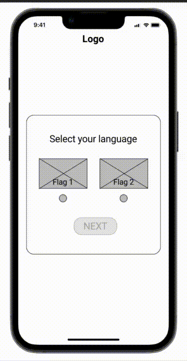
While ideating, my goal was to give the user an easy experience that could help them finish the path without losing confidence in themselves and the product. I decided to create a questionnaire where users can insert personal info like age, location, and gender (this can help us give them additional particulars about courses and workplaces) and then answer multiple-choice questions.
Before creating wireframes I had to organize the information architecture of the app & responsive website.

Afterward, it was finally time to draw some paper wireframes...


...and convert them into digital wireframes.


These buttons have been added to the homepage of the app because they are helpful to find motivation, direct researches, or ask questions towards other users.
Refining the design
The usability study did not find any user pain points. Nonetheless, to create mockups, there was the need for a design that would make the user feel at ease, as much as they have felt by using the low-fidelity prototype.


As you can see, to make the user feel at ease, I decided to use light colors, such as sky blue and white, and round squares.
Updating the design (2023)
After gaining work experience as a UX Designer, I decided to enhance the mobile app's interface. I replaced the light blue color with a darker shade to make it easier on the eyes and modernized the overall appearance of the app.


Responsive design
Desktop


Tablet


Mobile


